Sunday, March 4, 2012

Venturing into the Real World...

I am finally done with my portfolio! Well, at least until I finish my Studio V project and update it just before I graduate.

Here is my portfolio: http://dl.dropbox.com/u/64976849/portfolio%20slides.pptx

I love my new portfolio much more than my first one. My first portfolio, now, seems like I just put a bunch of projects together to show people because it was a ton of work gathering all of my work together and scanning it into a digital format. This time, I was able to focus on my layouts more because most of the work (scanning in my early projects) was already done. I chose a color block layout because it looks chic and clean with the added bonus that the style is "in" right now. I also chose my colors green and brown because they are without a doubt my style. I love earth tones, and those colors are exhibited in a lot of my work allowing the layout to complement my projects. The colors are muted and neutral enough to not draw attention away from my work, and the different color block layouts actually help emphasize certain projects.

My favorite project is my internship project. I liked the projects in did in hospitality and commercial design, but my special project I did on my internship was more important to me because of what it symbolized. For my project, my employer gave me a list of clients to choose from, and I chose a Rape & Abuse Crisis Center in Pennsylvania. I wanted them to be my client because it was going to be a charity project. I picked the room I wanted to design in the center; I selected the common room because I wanted everyone in the building - clients and workers alike - to enjoy my design.
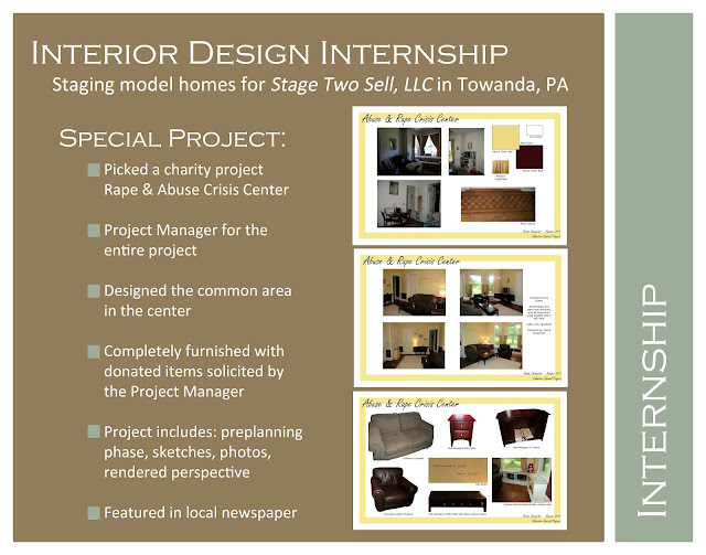
Portfolio Page introducing my internship project
For the special project, there was no budget because it was completely for charity. I had to go knock on local businesses' doors personally to ask for donations, arrange for furniture pick-ups, write letters and thank you notes, and I was a part of the project from conception to completion. I designed the room based on the shelter's needs, picked the colors and furniture, and I did all the manual labor with help from some friends and family. I was so proud of that room, and it made me remember why I want to be an interior designer. My employer even encouraged me to call a press release to show off my design in the local newspaper. I did get the local paper out to the shelter to interview me and take pictures, which made me feel amazing.  I absolutely loved doing all that work for them because they were truly grateful for my work.

My employer put together a SmileBox of all the work I put into the project. Thanks, Deb!
http://secure.smilebox.com/ecom/openTheBox?sendevent=4d6a55314e544d324d544d3d0d0a&blogview=true&campaign=blog_playback_link&playAgain=true

I would love to work in hospitality design because it's a blend between residential design, which is very much what the client wants, and commercial design, which is very creatively limiting from my point of view. No matter what design field I end up working in, I know from experience that it's very important to listen to the client. Even if the client says that whatever you like is fine, it's not. A good designer looks for hints or clues as to what the client really wants like showing pictures of other rooms and gauging the client's reaction or simply observing what the client already has in the home. I'm sure I'll have a whole list of Do's and Don't when I get out into the real world and work with real clients on designs. I can't wait to get out there and design.

Sustainable Solutions

Sustainability has always been a part of my life. My mother is an Environmental Engineer at Dobbins Air Reserve Base and is in charge of all hazardous waste as a small part of her job duties. She has been doing this job for 20+ years, so we have always recycled our trash at home because she saw the impact it made on the base. I guess my mother was used to it anyways because in NY you have to recycle, and a truck comes by to pick it up just like the garbage man.

I'm sure if every state did this, people would be more likely to recycle because that's the number one reason people don't recycle. It is inconvenient. I'm even a culprit of not recycling due to laziness. I've tried to recycle the past 3 years, but it never works out for multiple reasons. Last year, it was because neither my roommate nor I ever drove past the recycling center to drop off our recyclables.

Now that I'm thinking about it, I would like to look into what kind of services Bulloch county offers for picking up recycling. I know there are multiple recycling centers, but I would like for somebody to come pick it up for me because I never have time to drive out of my way or think about dropping it off. I could even start a program that picks up recycling if I find that there are no such programs in place.

After a fellow interior design student put recycling bags in the studio lab next to the trash can, I saw just how much our small studio classes can recycle on our own. I alone filled up half of the aluminum can bag with my Dr. Pepper cans...

Maybe I can recycle at home then bring my bags to campus and dump them in the school's recycling bins. Georgia Southern University has them all over campus, being an environmentally conscious school, and I go to campus every day. It would be very convenient.

The Art of Color

I love pops of colors. Whether it's design or fashion, I think it makes any ensemble look chic and well-put-together.

My favorite color combos: 
purple/silver or gray/black
aqua/coral/cream
black/white/sage green
light blue/brown/cream

I also love all earth tone colors; my design portfolio emphasizes this tremendously with my main colors being muted greens and browns. As for "painting the town red" - I'd prefer green J

When it comes to clothing, I love to layer up, accessorize, and add bright pops of colors; the little girl in the red shoes shares my style. 

In terms of interior design, I like to keep pops of color minimal but strong. I like to put them in places I want a lot of focus in a room like above a mantel, near windows with gorgeous views, or even in pillow/throws that emphasize carefully selected furniture. I like neutral wall colors for the most part (tan, grays, and cream/light yellow), so I can accent them with awesome accessories like I do with my clothing. I especially like to break up a wall with chair railing or throw in an accent wall in large spaces because it makes you look everywhere. Why just make the furniture look good when you have a 20' ft. high room? utilize the space and leave people gawking at your incredibly designed room because they can't decide what they like the most about your space. When designing, you should lead the eye in a fluid motion around the entire room, including all levels (floor, eye, and ceiling). 

I use the same principle with my outfits, which is the law of 3's. Not only is 3 a fantastic number, but it makes a room/outfit feel complete. I think it has to do with the golden mean with a perfect ratio revolving around 3. I use this law of 3's in interior design by putting whatever pop of color I want on all three levels. For example, in a cream beach house, I might use oranges and corals in the furniture and paint colors with pops of aqua in the rug (floor), the pillows (eye), and artwork or draperies (leads the eye to ceiling). In fashion, I would use the same concept with a cream dress with say aqua pumps, bracelets and a barrette. 

Popping design with colors makes me feel well-dressed/well-designed, confident, happy, and beautiful. I love how my fashion style inspires my interior design style...